Data and Graph instructions
You need the following by Monday October 7th.
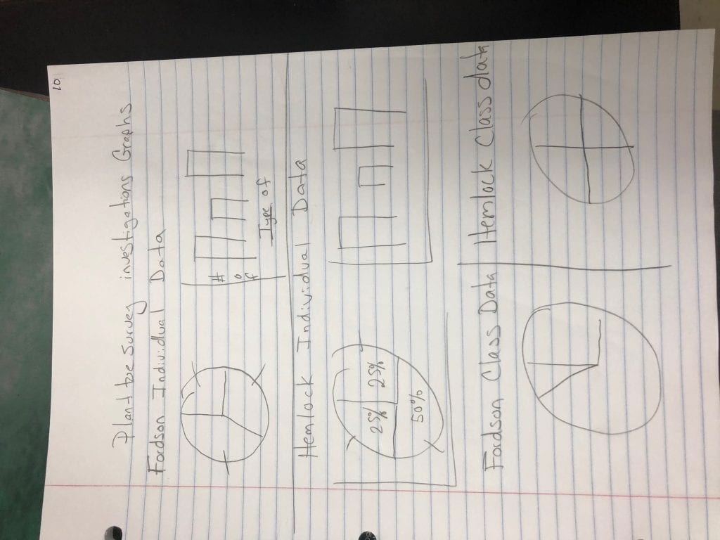
- A bar and pie chart for your individual data from Fordson on Google sheets
- A bar and pie chart for your individual data from Hemlock Park on google sheets
- A pie chart for class data from Fordson
- A pie chart for class data from Hemlock park
- All 6 charts copied in neatly and colored on PAGE 10 of your note book.
Making Charts for individual data on Google Sheets
- Open up Google Sheets
- Name your document: Plant Data Environmental Science
- In Column A, Row 1: Type “Fordson Vegetation Data”
- Enter your data below the header going down.
- Write out grass, weeds, or bare spots ( do not use letters)
- In Column B, Row 1: Type “ Hemlock Park Vegetation Data”
- Enter your data for Hemlock park below this going down
- Write out grass, weeds or bare spots (do not use letters)
Now you have your data in. Lets make some charts!
We are going to make bar charts and pie charts for each. You will have 4 charts total.
- Highlight just Column A
- Click on Insert > Chart
- It should automatically make a pie chart for you.
- In the chart editor > click on customize
- Go to Chart and axis titles > Change Title to “ Fordson Vegetation Data”
- Pie chart > Slide label > percentage
- Play around in this customized section. Make a couple of changes to make this graph unique.
- Move your pie chart out of the way
- Highlight Column A again
- Click on Insert > Chart
- In the chart editor > click on setup
- Chart type > Bar Chart
- Change the Title to “Fordson Vegetation Data”
- In the customize section
- Label your axes
- Y axis should say “ Number of plants”
- Make a couple of other changes to make your graph unique
- Move your graph out of the way
- Now do the same thing for your Hemlock Data. (Highlight Column B)
- You should have four charts in total!!!
Making Class Data Charts
- On ilearn . Open up your classes data
- File > make a copy
- Highlight just the totals and the headers for Fordson
- Insert> Chart
- In the Chart Editor, under set up, click on a pie chart
- You may need to click on “switch rows/ columns” at the bottom in the chart editor undersettings
- Do the same for the Hemlock Data
- Cut and paste your charts on the page for your individual data so they are all in the same place
You should have four charts in total!!!
Posted in Blogs by Darren Mccormick with no comments yet.
Leave a Reply